
Add a Feature
This project focused on adding a feature to an existing product by grounding the design process in user research. I chose Venmo and explored ways to improve awareness and education around its newer crypto offerings. Through user interviews, task flows, and usability testing, I identified that users were hesitant about crypto and needed clearer, more approachable guidance. The final solution introduced a lightweight onboarding flow that emphasized education without pressure, aligning business goals with user needs.
Research Summary
For this project, I conducted a competitive analysis using SWOT to compare Venmo against PayPal, Zelle, and Apple Pay. This helped identify Venmo’s strengths—such as strong brand appeal among young users and ease of use—as well as key weaknesses like privacy concerns, high instant transfer fees, and limited international support.
In addition to the competitive analysis, I conducted user interviews to gather direct feedback on how users perceive Venmo’s newer features like crypto and Venmo cards. To organize the qualitative data, I used affinity mapping, grouping user feedback into key patterns around trust, ease of use, lack of interest in crypto, and a desire for clearer education instead of aggressive promotion.
Together, the research showed that building user awareness and trust around crypto—rather than pushing adoption—would better align with user expectations. This insight directly informed my design strategy to create a lightweight, education-first onboarding flow for Venmo’s crypto feature.


Research Analysis
I began with a SWOT-based competitive analysis of Venmo, PayPal, Zelle, and Apple Pay, which revealed Venmo’s strengths in social payments and brand familiarity, but weaknesses in privacy, fees, and trust around newer features like crypto.
User interviews, supported by affinity mapping, confirmed that most users found Venmo easy to use but were confused or uninterested in crypto. Many preferred simple, secure transactions and wanted features like crypto to feel optional and better explained.
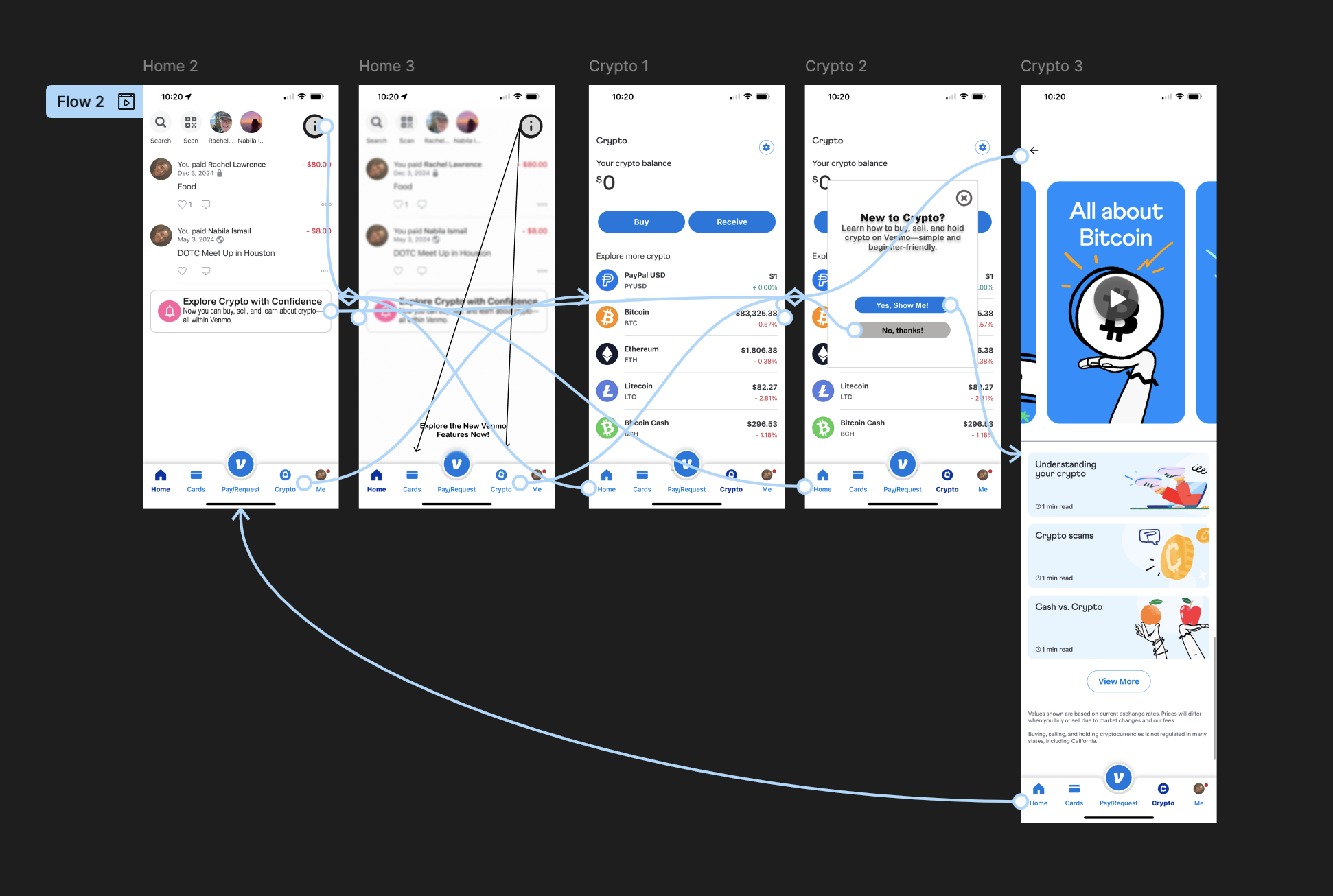
This led to a design direction focused on raising awareness through education, not promotion—helping users explore crypto confidently without pressure.
Designs
Conclusion
This project reinforced the importance of aligning business goals with real user needs. By focusing on education rather than promotion, I created a design solution that supports user trust while increasing feature awareness. It was a valuable exercise in balancing user hesitation with product strategy—reminding me that small, thoughtful improvements can make new features feel more approachable and user-centered.